Meaning from Nothing: John Neilson Lecture
Author: Tommy Morrison | 04.04.2016
In Feb 16 I was able to attend a talk by eminent letter carver John Neilson as part of the BCU School of Visual Communication’s programme of Type Talks curated by The Typographic Hub. All of the talks that I have been to over the last couple of years have been brilliant but this time I decided that I would take a few cheeky pictures and some notes.
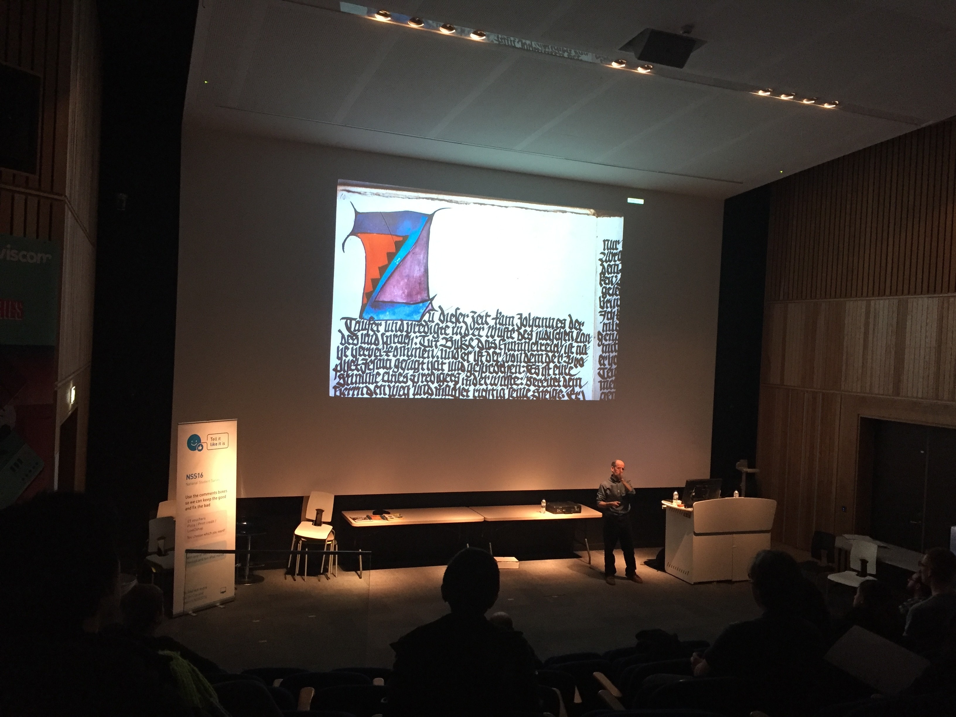
John’s ambition for the talk was not only to discuss his career but also give a brief overview about the history of his craft - tracing it back to Trajan’s column and Roman catacombs. One thing that I found fascinating was the family-tree style diagram slide which illustrated how the letter carving community was so intertwined. Each British practitioner today could trace his or her heritage all the way back through the people who taught them to Edward Johnston in England or Rudolf Koch in Germany.
Through examples that John showed, we saw the difference of the expressionist German lettering from the more formal UK contemporaries and moving swiftly through the generations of letter carvers we saw the individual styles and nuances of each practitioner.
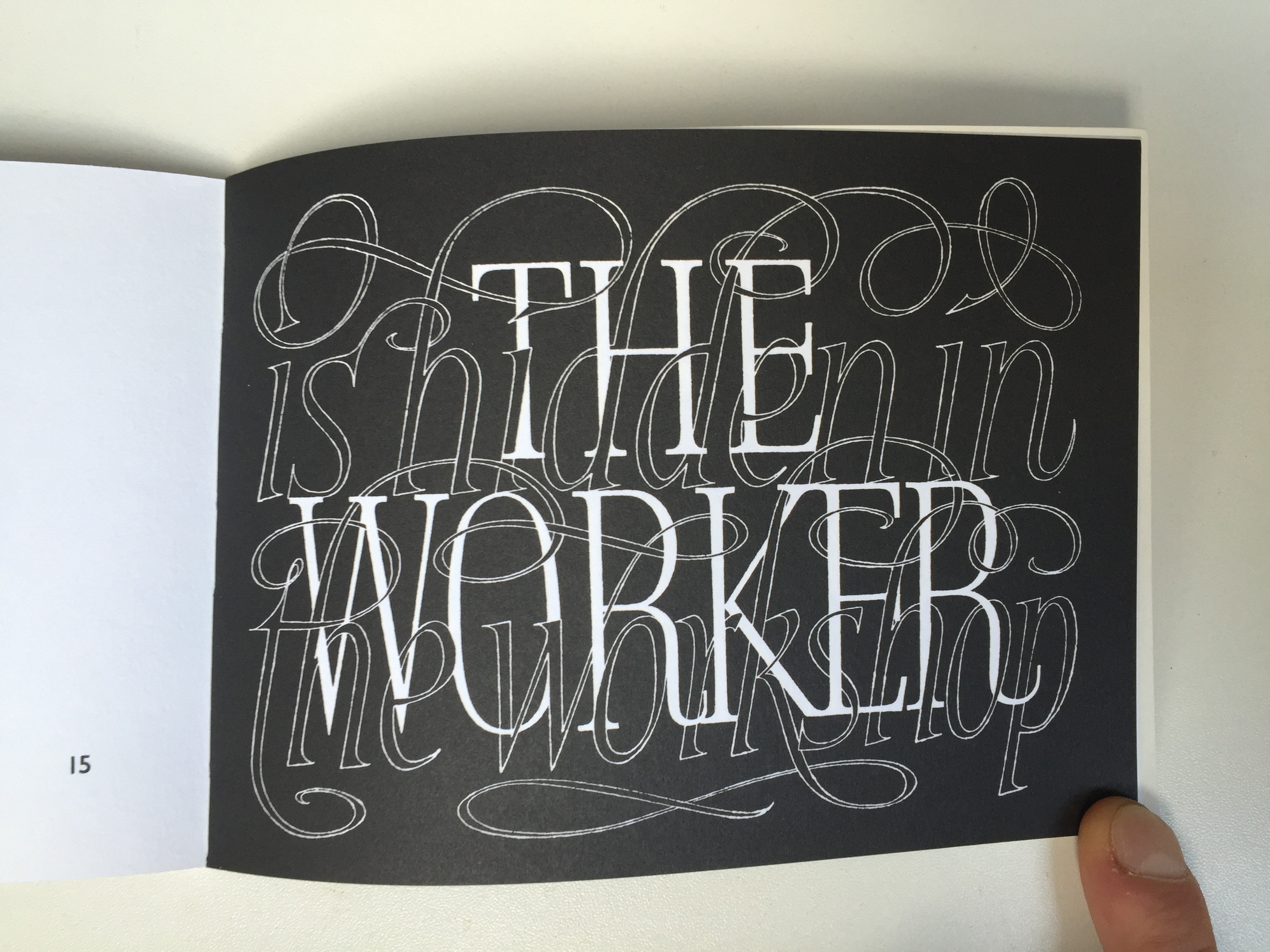
Some of the practitioners that I managed to scribble down were the Ditchling-trained Michael Biggs (from Stockport), Tom Perkins whose curved forms John described as being imbued with tension, the conceptual Gary Breeze, Norwegian sculptor Julia Vance, John’s sometime collaborator Malcolm Sier and David Kindersley. After the talk, looking at my notes, the name Kindersley actually seemed weirdly familiar and I realised that I recognised the name from a small book I have of his work.
But Back to John’s talk. It was very interesting to see how much goes into the craft of letter carving. One particular example illustrated John’s attitude to his public work. Some graffiti / street art had appeared on the reverse side of some carving that he had done. John said that he actually quite liked it and thought that the council should leave it. An issue that highlights the permanence and public ownership of the artform but what I also find interesting is that the ‘vandal’ chose not to disrupt the part of the object that John’s work appeared.
It is quite a physical job by the sounds of it, with some work needing to be carried out in situ as well as John’s studio. One of John’s most prominent pieces was his collaboration with Malcolm Sier for the carved lettering on the front of The Queen’s Gallery, Palace of Holyroodhouse. This seems to have been a bit of a departure for John as these were letterforms individually carved from stone as opposed to many letters carved into a single piece of stone. The spacing was decided by placing the giant letters in-line at one end of the garden and judging by eye, ‘nudging’ them left and right and then noting down all the measurements to give to the company that would install them.
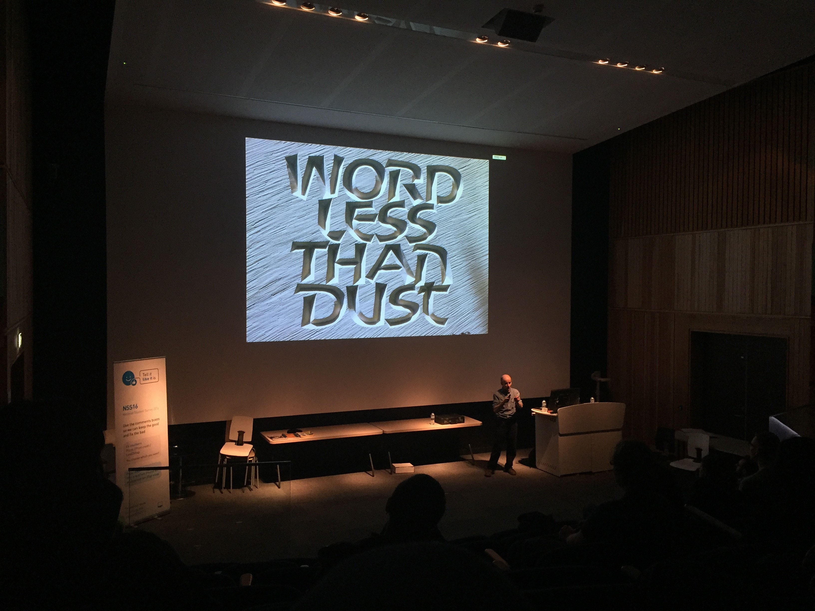
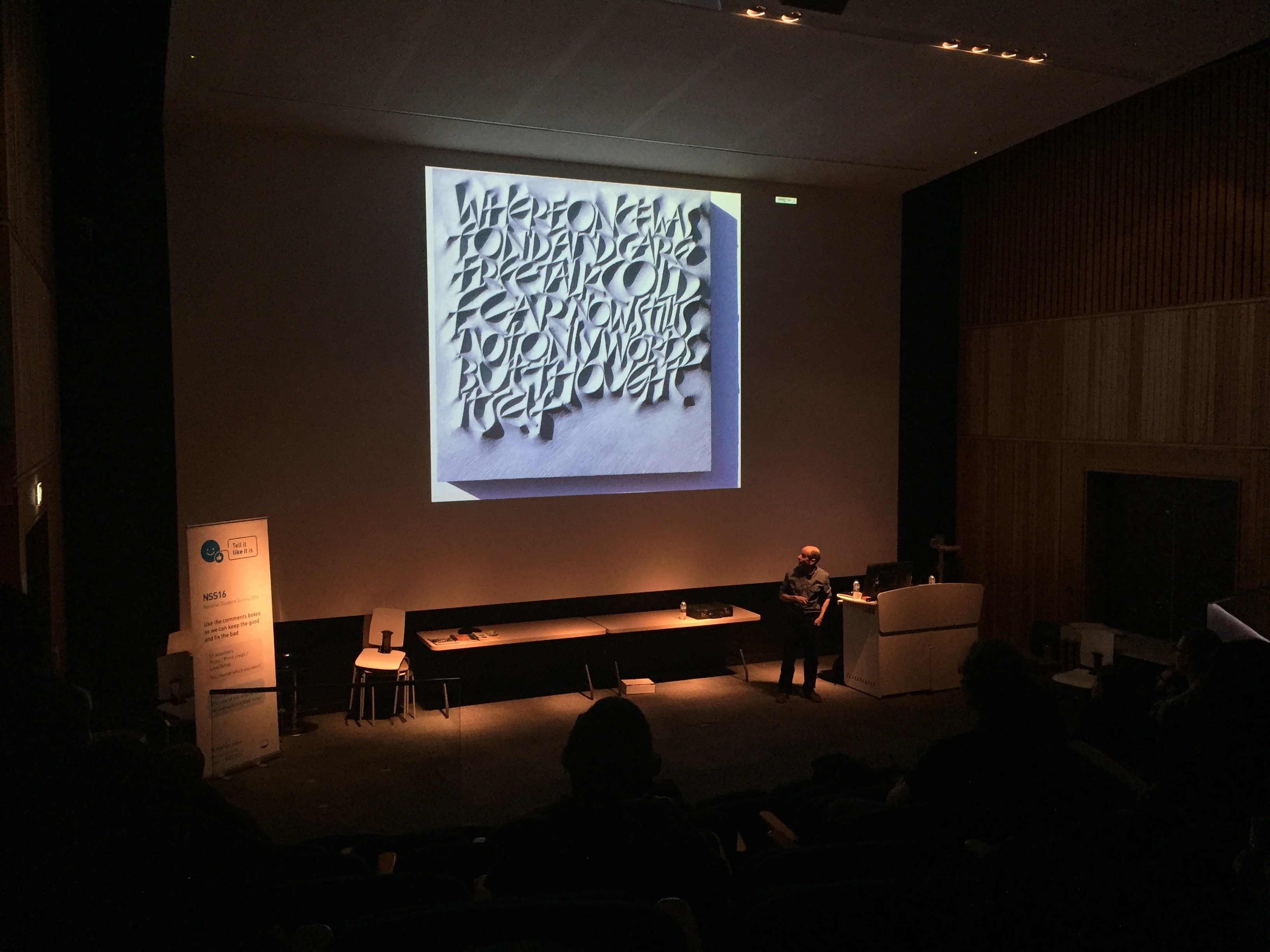
There were many really fascinating pieces in John’s talk, many of which I was not able to note down because of the pace at which he went through the slides. However one piece that did stand out for me was this one.
The unusual inverted carving method was really intriguing in itself, especially because of the smooth curves and sharp peaks of the letterforms. However when John discussed the meaning behind the work and how it related to the plight of the Tibetan people, that added far more to the piece. The white(ish) relief-based letterforms seem to reflect the mountainous geography of the Tibetan region and the angular, claustrophobic setting of the forms themselves seems very threatening in full Mcluhan-esque fashion. The piece is part of the Words Set Free Exhibition.
I think the reason that I am so awestruck by John’s (and his fellow letter carvers’) oeuvre is that he is physically creating meaning with each chisel cut. The pieces that he creates can be enjoyed in equal measure for their craftsmanship and for their messages. If you look in extreme close up you are lost in the beauty and physicality of the work and from a distance can appreciate the linguistic meaning as well.
John is featured in the 3rd issue of the Monotype Recorder.


